BSBG announces multiple roles in Eltiera Views
Brewer Smith Brewer Group (BSBG) has announced its roles in the design and development of Eltiera Views – the…
07 Apr 2026
Experience Loading
Suggestions: architecture engineering design
Words by BSBG Media Team, Wednesday 23 October 2019
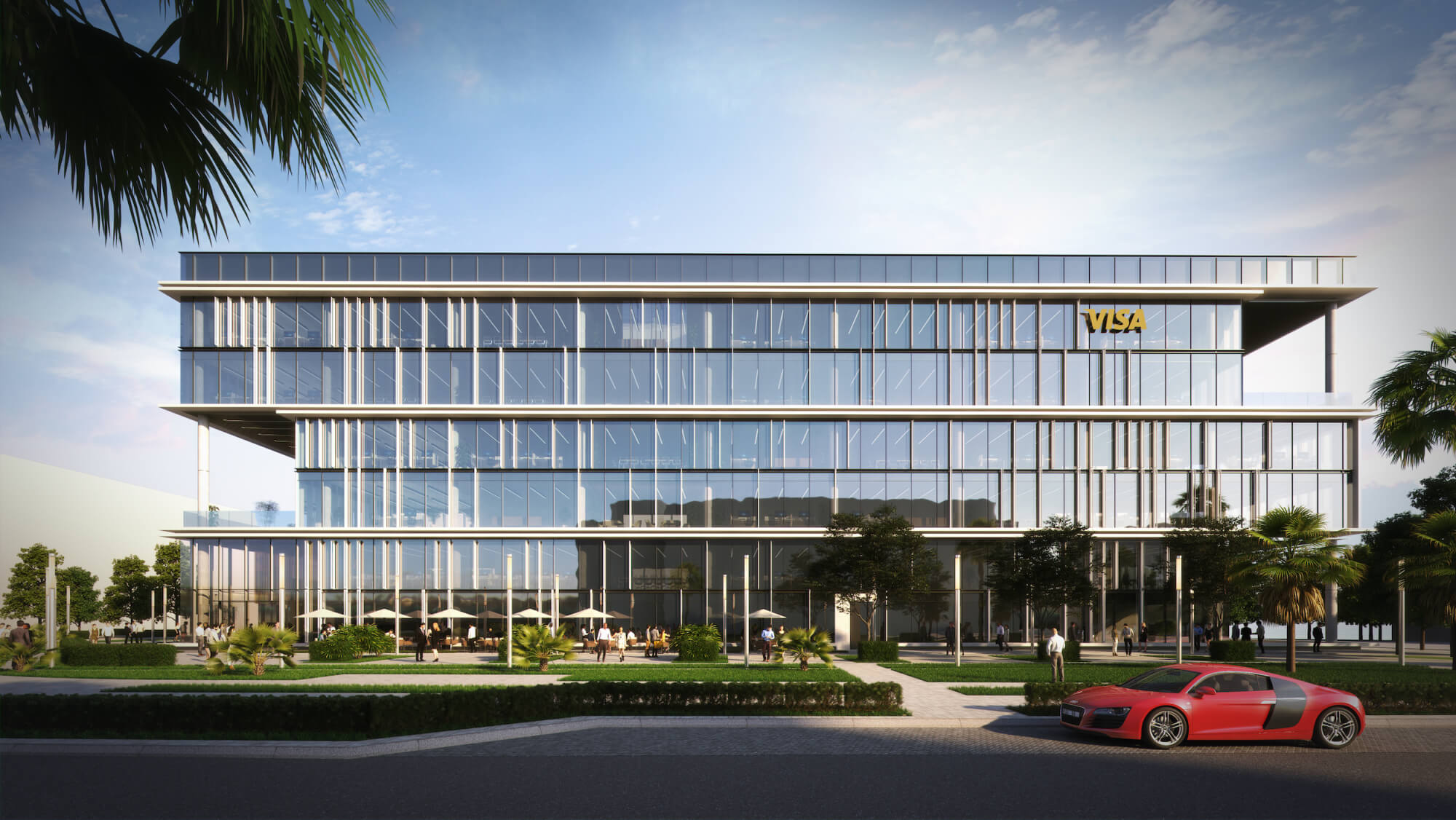
Brewer Smith Brewer Group (BSBG) today officially announces its role as the concept design architect for the exclusive new Visa Headquarters building located in Dubai Internet City. BSBG’s Group Design Director Michael Lewis led +studio (the BSBG design hub) through the concept phase in collaboration with long-term client, developer Sweid & Sweid.
The project is due for completion in June 2021, according to information released by the developer, and enabling works began just last week. In addition to the complete design packages, BSBG is also providing lead consultancy and structural engineering for the Visa HQ building. Our Group Design Director answered some questions about the project exclusively for the BSBG blog.
BSBG Media Team: Tell us about how you approached the design of the building, knowing that it is a commercial headquarters for one of the largest multinational financial services corporations in the world?
Michael Lewis: “We went on a journey to create a concept that celebrates the introduction of Visa as a brand coming to Dubai. It’s a hugely significant moment when you consider the strength of Visa’s position as the world’s pre-eminent financial services institution, so naturally this needed to be a landmark building which is instantly recognisable.
“The concept is founded on the strength of the internalised structure, featuring a strong rhythmical quality to the façade, with aspirations of becoming something of a reference point in terms of commercial design.”
MT: Was there any style in particular that inspired the design direction?
ML: “The idea of the stacked floor plates, the carved-out edges of the building that create these stacked forms – our approach here was actually driven by the site, a prominent corner area which is accessible and visible from all angles. The building is clean and simple at a fundamental level, but with intricacies and nuances that gain prominence the closer you get.
“We’re celebrating the prow of the building especially, as the intensity of activity in this area led the entrance point to be located there. The entrance in turn dictates the stacking of the floor plates, with the first floor terrace acting as an activated space, full of life, overlooking the front public plaza area.
“An intense study on the massing and façade resulted in this final product, and I was looking for a different rhythm to emphasise each of the three floor plates. The design language effectively centres around the use of white fins and heavily tinted dark glass. Adopting this context achieves a significant look and feel for the building.
“We had to create a solution appropriate for the Visa brand. It’s a prominent global organisation, where financial security and authority is of the upmost importance. We had to display its position as a tech savvy, connected and trustworthy organisation. I think we’ve achieved a standalone landmark building in that respect. It represents Visa as a brand, while also sitting comfortably in the context of Dubai Internet City.”

MT: You talk with passion about ‘experience of space’ and the need to promote an emotive connection between the architecture and end-user. How have those principles been applied in this project?
ML: “You can see from the street view the significance of this site. All edges of the building are live, it’s very exposed, and the building is eminently visible from all angles. It has to be well crafted from all sides.
“The site is connected to the walkable network of Dubai Internet City, and we’ve created a public realm experience so when people reach the building they feel they’ve arrived somewhere significant and somewhere dynamic. It stands out from the minutiae.
“We’re presenting an international corporate headquarters, but with commercial elements; cafés and retail, a public front face, a graded element and a public plaza. There are a number of leasable units at the prow of the building, and it links with the walkable network of the district to create the feeling of connectivity and promote the concept of a connected city.”
MT: What are the features of design that make this suitable for a business such as Visa?
ML: “In terms of the design we’ve delivered an appropriate solution that is both public facing, but also private, corporate and secure, in keeping with the business of Visa. It has been technically challenging, very tight in terms of site constraints for what is required. We spent a lot of time ensuring the efficiencies of the building met international standards, and there are six levels of basement parking as a result of that. The solution is world class, certainly in keeping with the design standards we set here at BSBG, in keeping with the Sweid & Sweid demands for each of their projects, and moreover, it’s a monument fitting for the world’s largest financial services organisation to call home.”
Brewer Smith Brewer Group (BSBG) has announced its roles in the design and development of Eltiera Views – the…
07 Apr 2026Brewer Smith Brewer Group (BSBG) has revealed key design details of Trio Park, a connected commercial hub that…
11 Feb 2026Construction at One River Point is now one year into the programme, with the residential tower reaching level…
06 Feb 2026For better web experience, please use the website in portrait mode